Navigation
A navigation provides users with a structured and intuitive way to go to different pages, sections or features of your website or application. It tells users where they are at all times and ensures they can easily get to where they need to go.
This pattern provides guidance for when and how to use navigation elements. The arrangement of navigation elements depends on the complexity of the interface that you're designing, the type of content or features accessed and the overall user experience goals. Use this pattern to provide consistency that helps users navigate your website or application easily and efficiently.
Use the pattern to indicate the structure and hierarchy of your site or application content. When deciding on your application’s navigation, it’s important to:
- Display navigation in websites or applications with two or more pages to indicate content hierarchy and help users orient themselves.
- Simplify your hierarchy to help users locate the information they want in the fewest clicks, to reduce the user's cognitive load.
- Label effectively with clear and concise label descriptions or visual cues, such as descriptive icons, to specify the information a navigation item or tab directs users to.
Navigation organizes content by placing it within a hierarchy. Elements at the top of the hierarchy are the most prominent and accessible, connecting users to lower elements in the hierarchy.
Use one or both of the two navigation structures below:
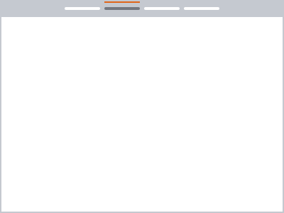
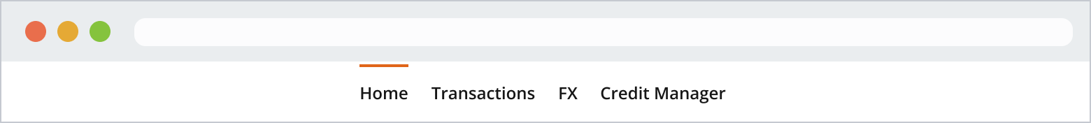
You would normally use a horizontal navigation within an application header, at the top of a page. Use it when you need a navigation that:
- Is always displayed in a prominent and consistent location.
- Affords movement from one set of content to another regardless of where the user is in the website or app.
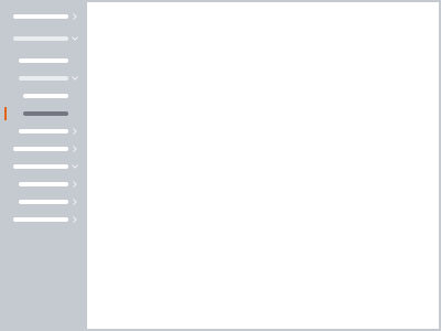
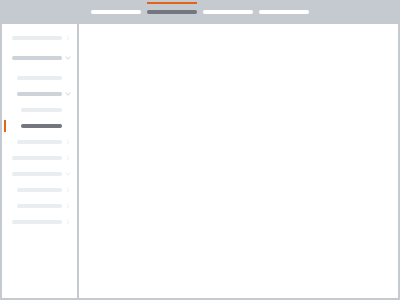
You would normally place a vertical navigation in a sidebar, on the left side of the screen, or within a drawer. It can display many navigation items at once. Use it when:
- You need to show many top-level views.
- You have deep navigation structures.
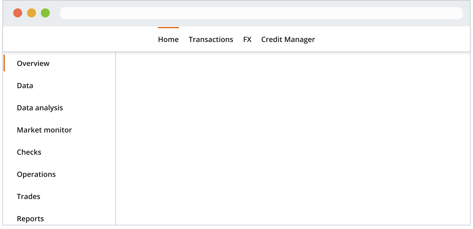
Combine both horizontal and vertical navigation when users need to:
- Navigate between multiple apps with horizontal navigation, and multiple pages within each app with vertical navigation.
- Navigate other complex hierarchies.
Navigation item components are navigational landmarks often used in the top or left areas of the user’s screen. The navigation item component comes in two orientations: horizontal and vertical.
By default, the navigation item has a horizontal orientation and hugs its content, but you can customize it so that its container can fit any preferred width.
Use horizontal navigation when you have fewer than eight items. Otherwise, consider a vertical group of items.
You can use icon descriptors to signify effectively the navigation item’s purpose, whether it’s related to a product’s identity, a specific tool, a function or a configuration setting.
Ensure that icon descriptors are consistent across all items within the same hierarchy level. This helps keep them equally weighted.
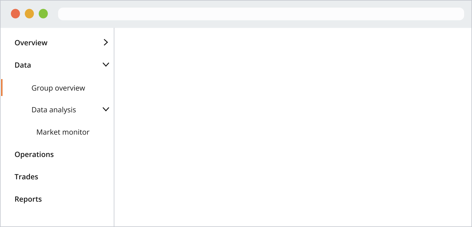
A common navigation practice is to have the primary categories that represent the main sections of your website or application in a vertical layout. This is usually placed on the left side of the screen. These primary categories can expand to reveal secondary categories or subcategories when selected, creating a hierarchical structure.
The number of vertical navigation levels depends on the complexity and depth of your website or application's information architecture (IA). We recommended being specific about your IA groupings to avoid ambiguity. When navigation is limited to two or three levels, it allows users to navigate quickly without overwhelming them with too many choices. However, when your IA requires wider navigation, you can extend it to more levels.
Read more in the vertical navigation pattern.

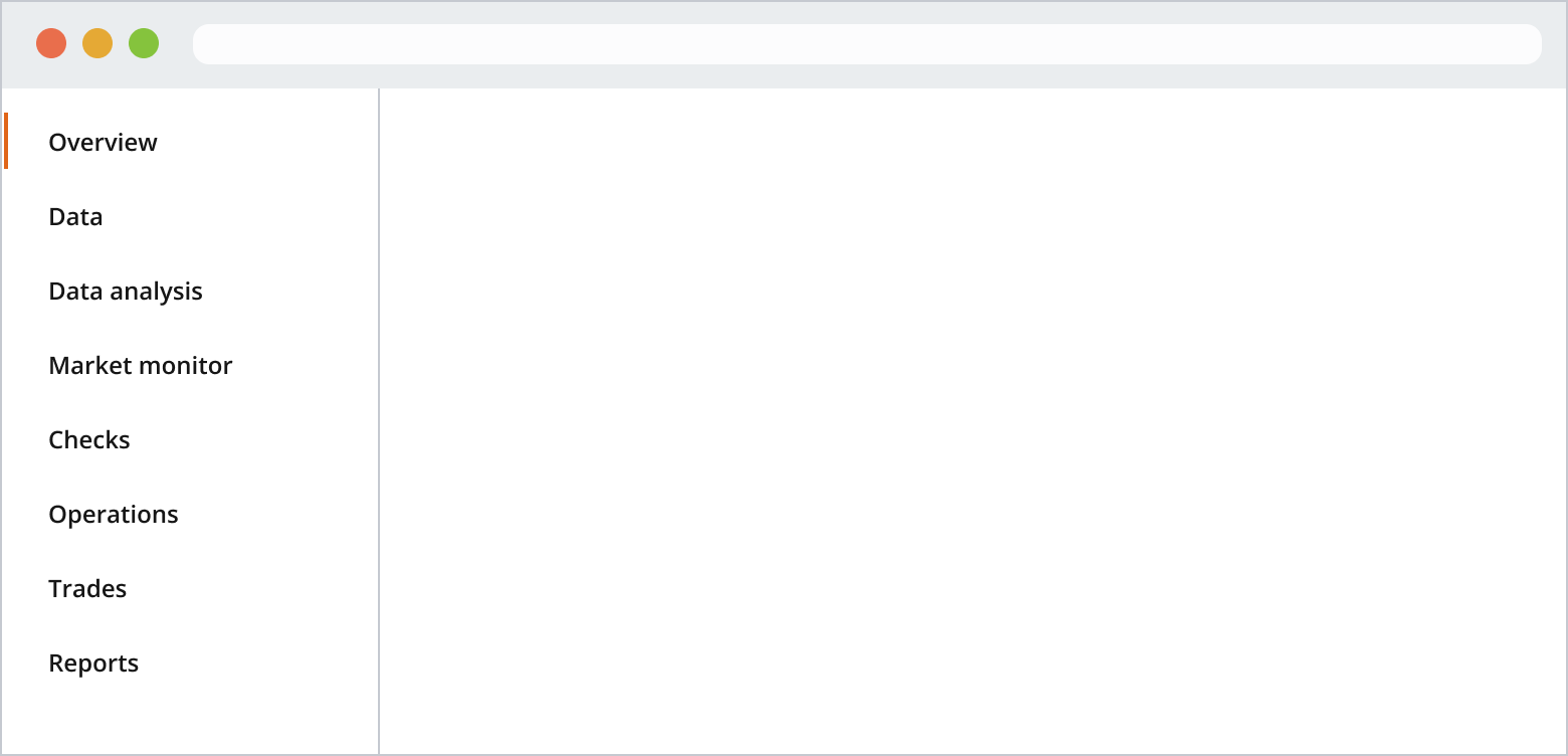
A single-level vertical navigation group provides a simple, single-level list of links that users can select within an application or website.
You can use a navigation item as a parent, which nests other navigation items inside it. Parent navigation items include a chevron on the right-hand side.
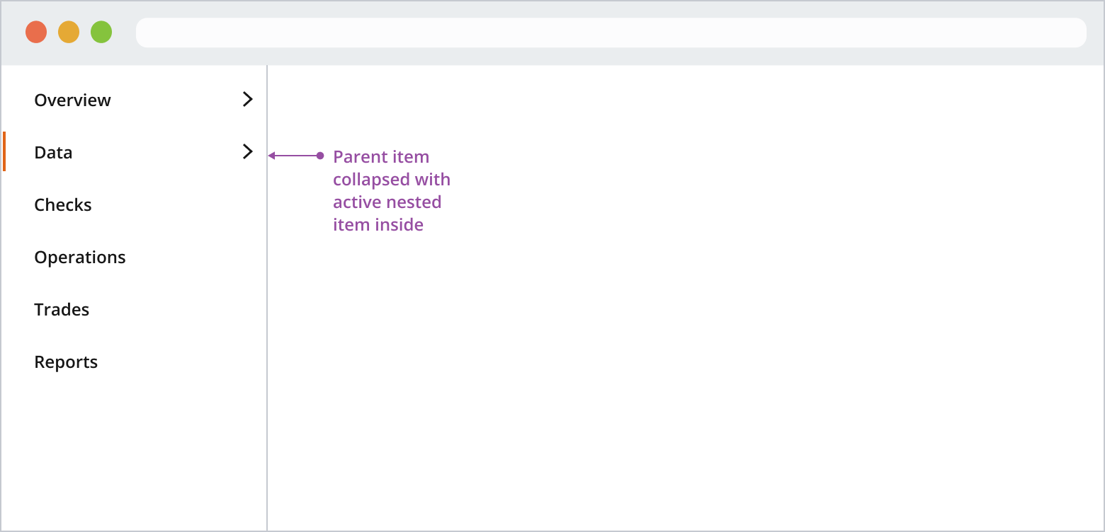
Clicking a parent item won't navigate the user but expand the group. If you need an overview page, it should be the first in the group. Overview pages don't include a chevron on the right-hand side.
Combined navigation can be useful in website or application contexts when you want to provide users with a versatile and efficient way to navigate complex content or features. It's ideal when your experience comprises multiple sub-apps, pages or sections, which in turn also require their own navigation.
Typically, the vertical navigation remains fixed in width when the user resizes the browser. You can set it to the width of your choice. However, you should consider the overall label length, theme, density and screen size you are designing for.
When your application is responsive, the content area should use its own layout grid. As the user adjusts their browser width, the navigation remains fixed until reaching a specified breakpoint, with only the content area adapting responsively based on the viewport.
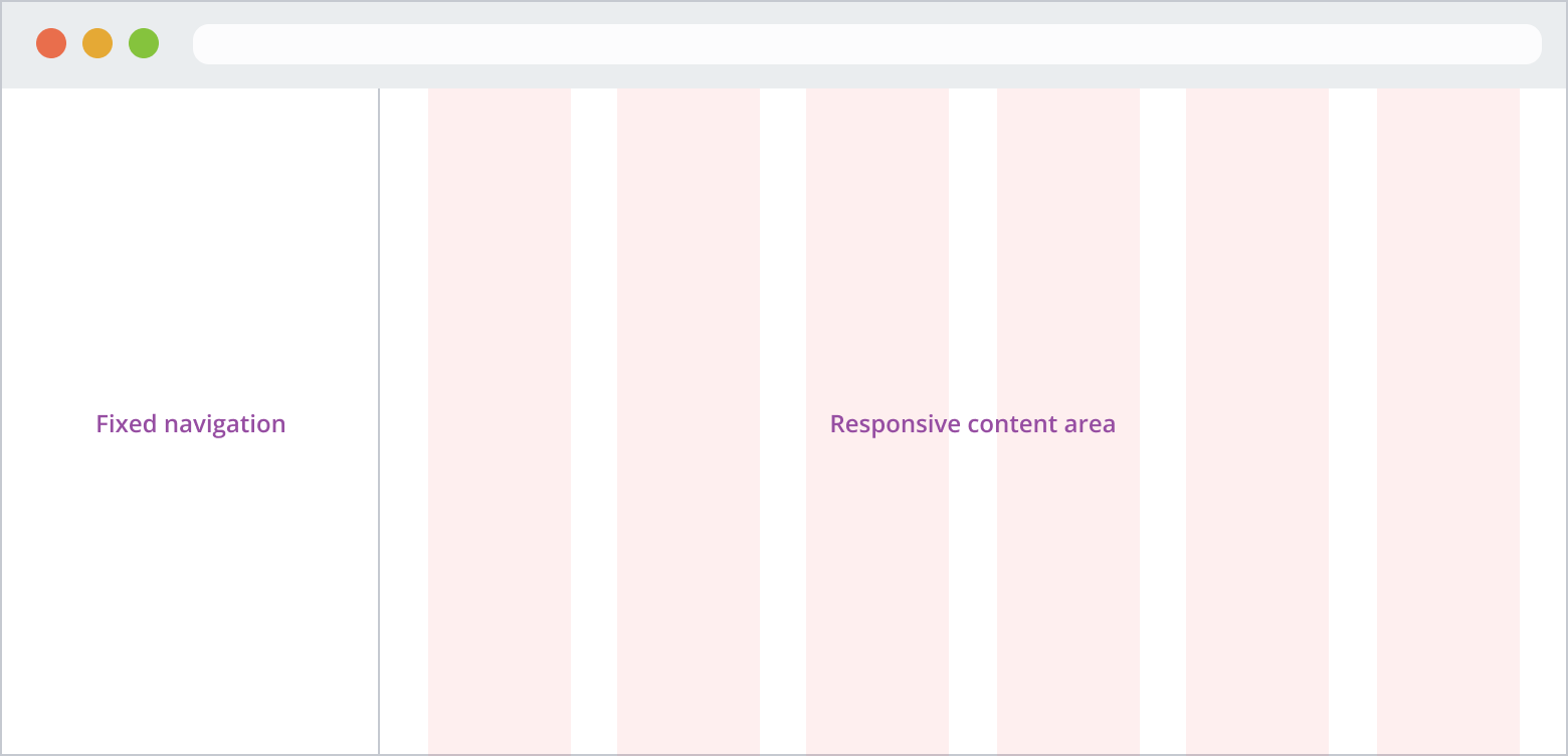
You can configure the vertical navigation component for fully responsive application experiences. Use the underlying layout grid to set a minimum width for your navigation pane and adjust your content area based on your predefined breakpoints.
- Use a layout grid for the full width of your app’s resolution if it isn't responsive, or just for the content area if it is.
- Use Salt breakpoints to determine how the navigation displays at various viewport sizes.
If you need to expand the pattern or share feedback with us, please contact the team.